
In the realm of modern web development, creating visually appealing and user-friendly interfaces can be a daunting task. With Material-UI, you can simplify designing and implementing intuitive user interfaces, saving valuable time and effort.
A powerful and versatile library, Material-UI provides developers with a comprehensive set of pre-built components and tools, enabling them to create stunning web applications.
By fine-tuning color palettes, typography, and other design elements, developers can quickly customize themes to suit specific design needs without reinventing the wheel with repetitive code.
Yet, the benefits of good customization extend beyond aesthetics, like efficiently building reusable and maintainable codebases. This scalability empowers teams to adapt and evolve their applications over time, effortlessly accommodating new features and functionalities.
Below, you’ll find a step-by-step guide that closely follows the documentation for full customization of the theme.
You can also access the final project here.
First, Install All Project Dependencies
- Create the React project with Vite
npm create vite@latest
- Select React project with Typescript
- Install mui packages
npm install @mui/material @emotion/react @emotion/styled
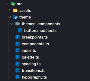
Create A Folder Structure
You’ll need to start with the project structure, and then build the files required for customization.
It would be best if you first gained a comprehensive understanding of the customization process and its implementation within Material UI to understand these different pieces and how they work together perfectly.
This is the theme folder structure:
The index.ts file serves as the central point in our TypeScript project. It acts as the binding point for all other files related to the theme. You can fully customize the theme object in this file.
By default, the theme object contains various properties. To demonstrate, let’s consider adding a new property called status to the theme.
To ensure type safety with TypeScript, use module augmentation declaration. This pattern allows you to add new properties to the theme or remove existing ones as needed.
*It’s important to note that the theme object is returned based on a prop called mode. This allows you to export custom colors for light mode and separate ones for dark mode.
By dynamically switching the mode prop, you’ll retrieve the appropriate theme object with the desired color palette.
index.ts
import { createTheme } from "@mui/material";
import { orange } from "@mui/material/colors";
import { darkModePalette, lightModePalette } from "./palette";
import { typography } from "./typography";
import { spacing } from "./spacing";
import { breakpoints } from "./breakpoints";
import { transitions } from "./transitions";
import { components } from "./components";

export enum ThemeVariantsProps {
 light = "light",
 dark = "dark",
}

declare module "@mui/material/styles" {
 interface Theme {
   status: {
     danger: string;
   };
 }
 interface ThemeOptions {
   status?: {
     danger?: string;
   };
 }
}

export const theme = (mode: ThemeVariantsProps) => {
 return createTheme({
   palette: {
     mode,
     ...(mode === "light" ? lightModePalette : darkModePalette),
   },
   typography,
   spacing,
   breakpoints,
   transitions,
   components,
   status: {
     danger: orange[500],
   },
 });
};
Now, let’s explore the other files within the theme folder to understand better their respective responsibilities and how they work together.
You can check the default theme object here.
Customizing MUI (Colors, Fonts, Spacing, etc.)
In the palette.ts file, you can define the colors used in your application. You can choose from two sets of colors: one for light mode and one for dark mode. These color sets define the palette used throughout the app.
Additionally, you can introduce a new set of colors called “neutral” and a new variant called “darker.” This allows you to have a broader range of color options for various elements in our app.
By defining these colors, you can maintain consistency in the visual appearance of our application and easily apply the desired color scheme based on the selected mode (light or dark).
palette.ts file
import { PaletteOptions } from "@mui/material";

declare module "@mui/material/styles" {
 interface PaletteColor {
   darker?: string;
 }
 interface SimplePaletteColorOptions {
   darker?: string;
 }
 interface Palette {
   neutral: Palette["primary"];
 }
 interface PaletteOptions {
   neutral: PaletteOptions["primary"];
 }
}

export const lightModePalette: PaletteOptions = {
 primary: {
   main: "#f44336",
   light: "#f6685e",
   dark: "#aa2e25",
   darker: "#512da8",
 },
 secondary: {
   main: "#ffea00",
   light: "#ffee33",
   dark: "#b2a300",
 },
 neutral: {
   main: "#5d4037",
   light: "#aea09b",
   dark: "#4a332c",
 },
};

export const darkModePalette: PaletteOptions = {
 primary: {
   main: "#0A1172",
   light: "#63C5DA",
   dark: "#3944BC",
   darker: "#3944BC",
 },
 secondary: {
   main: "#097969",
   light: "#90EE90",
   dark: "#00A36C",
 },
 neutral: {
   main: "#805158",
   light: "#73494f",
   dark: "#5a393e",
 },
};
For example, check how I’ve set the Pacifico font as the default typography in this file. I also introduced a new “poster” variation and disabled the h3 variant.
typography.ts
import { TypographyOptions } from "@mui/material/styles/createTypography";

declare module "@mui/material/styles" {
 interface TypographyVariants {
   poster: React.CSSProperties;
 }
 interface TypographyVariantsOptions {
   poster?: React.CSSProperties;
 }
}
declare module "@mui/material/Typography" {
 interface TypographyPropsVariantOverrides {
   poster: true;
   h3: false;
 }
}

export const typography: TypographyOptions = {
 fontFamily: "Pacifico",
 h1: {
   fontFamily: "sans-serif",
   fontSize: 50,
 },
 poster: {
   fontSize: 30,
 },
 subtitle1: {
   fontSize: 11,
 },
 h3: undefined,
};
Also, the Pacifico font was imported in the index.html file inside the head tag:
<link   href="https://fonts.googleapis.com/css2?family=Nunito+Sans:ital,wght@0,200;1,200;1,1000&family=Pacifico&display=swap"
     rel="stylesheet"
 />
Here, I override the default spacing property with a function. The function takes a number as a parameter and returns another number that represents the desired spacing value.
By implementing this customization, you can have fine-grained control over the spacing between elements. It allows you to define spacing values dynamically based on your specific requirements or design preferences.
spacing.ts
declare module "@mui/material/styles" {
 interface Theme {
   spacing: (s: SpacerIndex) => number;
 }
 interface ThemeOptions {
   spacing: (s: SpacerIndex) => number;
 }
}

export type SpacerIndex = keyof typeof spaces;

const spaces = {
 0: 0,
 1: 4,
 2: 8,
 3: 12,
 4: 16,
 5: 30,
 6: 100,
};

export const spacing = (index: SpacerIndex) => {
 const scalingFactor = 1.5;
 return spaces[index] * scalingFactor;
};
breakpoints.ts
declare module "@mui/material/styles" {
 interface BreakpointOverrides {
   mobile: true;
   tablet: true;
   xs: false;
 }
}

export const breakpoints = {
 values: {
   xs: false,
   sm: 600,
   md: 900,
   lg: 1200,
   xl: 15232,
   tablet: 640,
   mobile: 500,
 },
};
transitions.ts
import { TransitionsOptions } from "@mui/material";

declare module "@mui/material/styles" {
 interface Easing {
   customAnimation: string;
 }
}

export const transitions: TransitionsOptions = {
 duration: {
   shortest: 150,
   shorter: 200,
   short: 250,
   // most basic recommended timing
   standard: 300,
   // this is to be used in complex animations
   complex: 375,
   // recommended when something is entering screen
   enteringScreen: 225,
   // recommended when something is leaving screen
   leavingScreen: 195,
 },
 easing: {
   // This is the most common easing curve.
   easeInOut: "cubic-bezier(0.4, 0, 0.2, 1)",
   // Objects enter the screen at full velocity from off-screen and
   // slowly decelerate to a resting point.
   easeOut: "cubic-bezier(0.0, 0, 0.2, 1)",
   // Objects leave the screen at full velocity. They do not decelerate when off-screen.
   easeIn: "cubic-bezier(0.4, 0, 1, 1)",
   // The sharp curve is used by objects that may return to the screen at any time.
   sharp: "cubic-bezier(0.4, 0, 0.6, 1)",
   // custom animation
   customAnimation: "cubic-bezier(0.4, 0, 1, 1)",
 },
};
How to Customize Material UI Components
So far, I’ve shown you how you can customize various aspects of our application, such as colors, typography, spacing, breakpoints, and transitions, based on user needs.
The final important part is customizing the components exported by the Material-UI (MUI) library. In the documentation, there are several methods provided to achieve this customization. These methods allow you to modify the MUI components’ default behavior, appearance, or functionality.
In the next section, you’ll see how you can use Global theme overrides.
Start by creating the necessary files:
This components.ts file serves as a central place to import the components that will be customized or modified in the project using global theme overrides. Let’s take, for example, the Button component.
components.ts
import { Components } from "@mui/material";
import { MuiButton } from "./themed-components/button.modifier";
import { Theme } from "@mui/material/styles";

export const components: Components<Theme> = {
 MuiButton,
};
And here, you can change the appearance of the button by adding new properties
button.modifier.ts
import { Components, Theme } from "@mui/material/styles";

declare module "@mui/material/Button" {
 interface ButtonPropsVariantOverrides {
   primary: true;
   secondary: true;
 }
}

export const MuiButton: Components<Theme>["MuiButton"] = {
 defaultProps: {
   variant: "primary",
   disableElevation: true,
 },
 styleOverrides: {
   root: ({ theme }) => {
     const {
       palette: {
         primary: { dark },
       },
     } = theme;
     return {
       borderRadius: 20,
       width: 300,
       border: `1px solid ${dark}`,
     };
   },
 },
 variants: [
   {
     props: { variant: "primary" },
     style: ({ theme }) => {
       const {
         palette: {
           mode,
           primary: { dark, light },
           getContrastText,
           text: { primary },
         },
       } = theme;
       return {
         backgroundColor: light,
         ":hover": {
           backgroundColor: dark,
           color: mode === "light" ? getContrastText(primary) : primary,
         },
       };
     },
   },
   {
     props: { variant: "secondary" },
     style: ({ theme }) => {
       const {
         palette: {
           secondary: { dark },
         },
       } = theme;
       return {
         borderRadius: 5,
         width: 200,
         ":hover": {
           backgroundColor: dark,
         },
       };
     },
   },
 ],
};
Let’s break down what defaultProps, styleOverrides, and variants are all about and how they help you:
- defaultProps: This property is used to set the default values for the component’s props.
- styleOverrides: This property allows you to override the default styles of the component. In the snippet, the styleOverrides object defines a function for the root style. This function receives the theme object and extracts the necessary values from it. It then returns an object with CSS properties and values that will be applied to the root element of the button.
In Material-UI, the styleOverrides property allows you to configure styles based on the CSS class names or rule names provided by the Material-UI API.
- variants: This property is used to define different variants of the component based on specific props. Each variant object within the variants array specifies the props that trigger the variant and the corresponding styles to apply.
To observe the changes reflected by the new custom theme, you need to modify the App.tsx file accordingly.
Here’s how you can achieve that:
function App() {
  const [mode, setMode] = useState<ThemeVariantsProps>(
    ThemeVariantsProps.light
  );
  const activeTheme = useMemo(() => theme(mode), [mode]);
  const handleOnChange = useCallback(
    () =>
      setMode(
        mode === ThemeVariantsProps.light
          ? ThemeVariantsProps.dark
          : ThemeVariantsProps.light
      ),
    [mode]
  );
  return (
    <ThemeProvider theme={activeTheme}>
      <Button>
        <Typography>Primary</Typography>
      </Button>
      <Button variant="secondary">
        <Typography>Secondary</Typography>
      </Button>
      <Switch onChange={handleOnChange} />
    </ThemeProvider>
  );
}
export default App;
If you want to better understand MUI customization, I recommend cloning the project repository. This will provide you with a more comprehensive understanding of the topic.
Conclusion
In conclusion, customizing themes becomes an intuitive and straightforward task by leveraging Material-UI’s comprehensive set of pre-built components and intuitive features.
The ability to fine-tune color palettes, typography, and other design elements allows you to create cohesive and aesthetically pleasing interfaces.

 React Query - The Basics of TanStack’s Latest Data Fetching Library
  Bun.js - JavaScript’s Newest Runtime Shows Increased Speed and Performance in Building Applications